If you are ever in southeastern Wisconsin, I highly recommend a stop at the Kohler Design Center in Kohler, Wisconsin. People come from all over to visit this kitchen and bathroom dreamland (located across the street from the Kohler factory), but I'm lucky enough to live about a 25-minute drive away.
We're hoping to add a bathroom sometime soon (I'm not sure this is possible, but we're already behind schedule before we even start), and I actually got my husband to agree to come to the Design Center with me so I could get a feel for what he really likes and really doesn't like. Frankly, most Kohler fixtures are out of our budget, but the Design Center is a great place to brainstorm ideas and I was surprised to find that some things aren't as expensive as I thought they would be.
There is a toilet museum on the lower level that memorializes the history of toilets (and it's more interesting than you might think) but I didn't go down there this time because really, how many times do you need to review the history of toilets? My husband, however, did make a stop down there to use the bathroom saying that looking at all these toilets made him had to go!
I took the camera along to take pictures of some of the things we like, but I thought I'd share a few photos with you to give you a taste of the dreaming you can do there. There are a lot of pictures here so bear with the length of the post. If you want to see them larger, just click on them.
Hugh Hefner's bathtub?
How's this for a few body sprays? All controlled via a digital touchpad, of course.
I sort of liked this sink and was surprised to find later that I could buy it online for as little as $80.
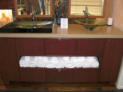
A really cool vanity
I must have a teak floor in my shower!
I thought this penny round tile floor was really neat looking but I couldn't help but think about how dirty all that grout would get.
This bathroom is a wild design with wild tile to match. Check out the freestanding vanities in the middle of the room. The shower is open, under the windows. It's not a bathroom I'd want but I love the light, airy feeling of it.
This is the showerhead in the bathroom above. I love the grid they did on the ceiling.
I love this vanity. Not loving the unmatching sinks.
This bathroom had gray tile and a lilac sink, toilet, shower and bathtub. Amazingly, it worked.
This is the floor in the above bathroom. It's absolutely spectacular Ann Sacks tile.
Your eyes do not deceive you: This is a huge, two-story wall of toilets (San Raphael model, in case you were wondering) in every color imaginable.
The mirror in this mini-kitchen was amazing.
Talk about mirrors! All of the cupboards in this kitchen had mirror insets. I'm not sure what the random cocktail dress was doing there.
I LOVE the open shelves in this kitchen. Like LOVE IT, love it.
Another vanity I like
This was truly a spa bathroom, complete with this wood shower.
This was the vanity in the spa bathroom.
Don't you have a massage table in your bathroom?
This was the coolest medicine cabinet. It opened by sliding up and revealed a magnifying makeup mirror and all sorts of cubbies for organizing things. Very contemporary (and about $2,900 a pop) but neat!
I'm not sure what the practical application of this sink is, but I'm guessing if you have the money to afford it, practical applications aren't really a big concern.
One of the best things to look at at the Kohler Design Center are the hand-painted sinks (which remind me of my grandma, who had one in her house). These were just a few of the beautiful sinks there.
Labels: bathroom, Kohler Design Center, tour


4 Comments:
Great shots! Makes me dream of the perfect bathroom I would want! Love the painted sinks! Thank you for sharing!
I do love the teak on the bathroom shower too!
We went there a number of years ago. I loved some of the things I saw, but mostly I kept looking at rooms and fixtures and thinking they were all designed to be cleaned by someone other than the homeowner. Seemed like that was the least of any consideration in the design process. Since we do all the cleaning at our house with no outside help, that was something we gave a lot of thought to when we redid our kitchen and baths.
You are so right, Linda! Practicality is sometimes the last thing that's thought of.
Post a Comment
Thank you for taking the time to comment! I appreciate it. I try to respond to comments here or sometimes via email so make sure to check back.
Subscribe to Post Comments [Atom]
<< Home