How to get FREE nautical charts
If you've ever wanted to do anything with a nautical chart, plan it now.
What might you want to do with a chart, other than, you know, navigate? Allow me to give you a few ideas.
So here's why you need to at least do a little planning now. Last week, NOAA announced that it will no longer print paper charts. They will still be available through a print-on-demand service but they aren't cheap. Until now, the most economical way to do anything crafty with a chart was to find someone throwing out outdated ones (Mr. Much More Patient threw out HUNDREDS of them a few years ago; yes, I could kill him). But during the somewhat controversial change to paper charts only being available through print-on-demand services, NOAA is offering free downloads of all its charts in PDFs of high enough quality that they can be printed out full size, which can be quite large depending on the chart. The first Christmas gift I gave Mr. MMP was a framed version of the full Great Lakes chart and it is about 4-1/2 feet wide. (Interesting note: That was almost 20 years ago and while it might sound like a great gift, somehow he thought I was getting him a puppy. Hmmm, framed chart vs. puppy. Hard to cuddle with the giant chart.)
But I digress. The point is, if you download the PDFs of the charts you might want now, all you have to do in the future when you want to use them is print them out. And I would imagine a really creative person could manipulate them to turn them into something completely different.
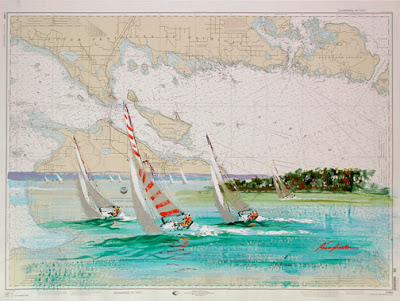
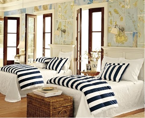
Maybe use them as a canvas for art like this.
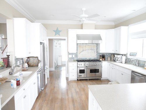
Or maybe make some cool lamp shades.

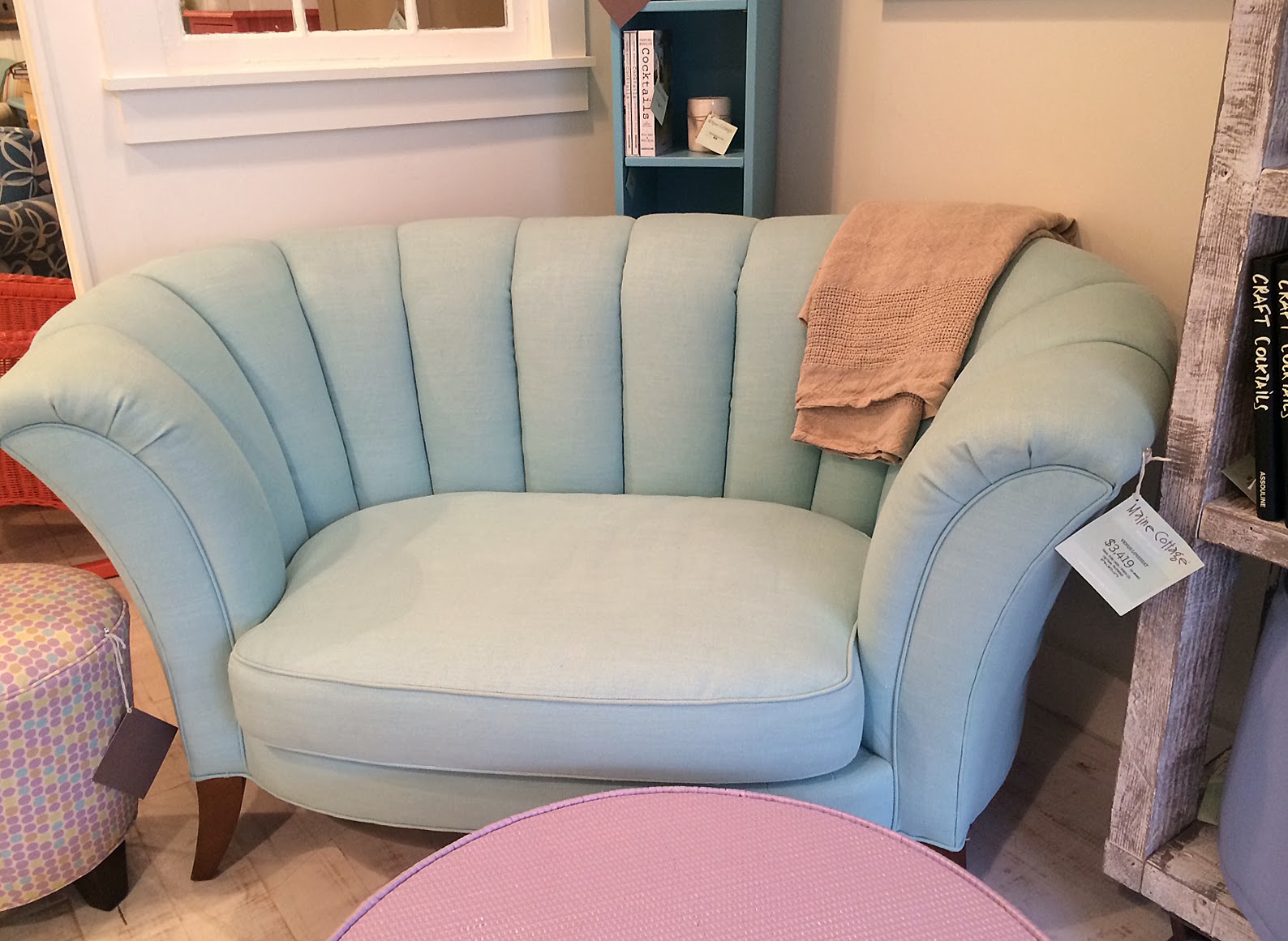
Or a really cool coffee table, unique book covers, creative wedding invitations, fun gift tags or maybe cupcake flag toppers. If you have a kid who is really into the pirate thing (my nephews were nuts for pirate stuff), just think about all the cool decorations you could do for a party (maybe pin the treasure chest on the island on a chart?).
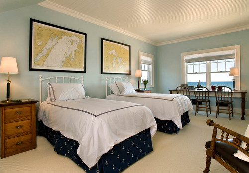
If you've taken a really special trip near the water or have a place on the water that is close to your heart, think about framing a chart as a gift or memento. We have two framed charts hanging in our house (they are in the back room that you've never seen before because it's basically a mess). One is the aforementioned huge chart of the Great Lakes, but the other is a Lake Michigan chart that Mr. MMP drew the course that his crew sailed (as well as the times they were in each spot) in 1992 when they won the Chicago-Mackinac Race overall. It's a huge achievement for a racing sailor to win that race and that chart is a great way to remember it.
OK, you're sufficiently inspired to maybe do something with a nautical chart. Here's how you get the free downloads. The free download program started October 22 and will only last three months. After that you're probably going to have to pay.
1. Start here. This link breaks down the charts by general region. Click on the catalog icon for whichever region you are interested in.

2. The catalog will show you the region with a bunch of blue boxes on it. Zoom into the area you are interested in and make a note of the five-digit number on the border. That is the chart number you want to download.
3. Once you know what number charts you want to download, go here and click on the chart number to download it.
That's it.
Go forth and download. And then tell me what you're going to do with them.
What might you want to do with a chart, other than, you know, navigate? Allow me to give you a few ideas.
 |
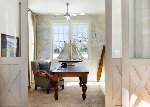
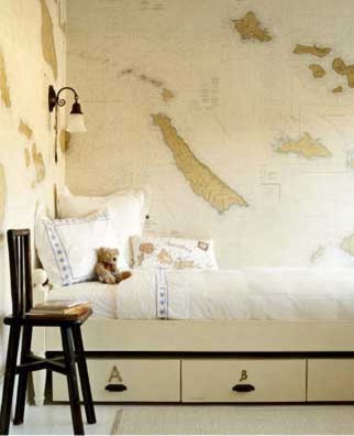
| I can't find an original source for this photo. If you know it, please let me know. |
But I digress. The point is, if you download the PDFs of the charts you might want now, all you have to do in the future when you want to use them is print them out. And I would imagine a really creative person could manipulate them to turn them into something completely different.
Maybe use them as a canvas for art like this.

Or maybe make some cool lamp shades.

Or a really cool coffee table, unique book covers, creative wedding invitations, fun gift tags or maybe cupcake flag toppers. If you have a kid who is really into the pirate thing (my nephews were nuts for pirate stuff), just think about all the cool decorations you could do for a party (maybe pin the treasure chest on the island on a chart?).
If you've taken a really special trip near the water or have a place on the water that is close to your heart, think about framing a chart as a gift or memento. We have two framed charts hanging in our house (they are in the back room that you've never seen before because it's basically a mess). One is the aforementioned huge chart of the Great Lakes, but the other is a Lake Michigan chart that Mr. MMP drew the course that his crew sailed (as well as the times they were in each spot) in 1992 when they won the Chicago-Mackinac Race overall. It's a huge achievement for a racing sailor to win that race and that chart is a great way to remember it.
OK, you're sufficiently inspired to maybe do something with a nautical chart. Here's how you get the free downloads. The free download program started October 22 and will only last three months. After that you're probably going to have to pay.
1. Start here. This link breaks down the charts by general region. Click on the catalog icon for whichever region you are interested in.

3. Once you know what number charts you want to download, go here and click on the chart number to download it.
That's it.
Go forth and download. And then tell me what you're going to do with them.
Labels: chart wallpaper, decorating with nautical charts, free nautical charts, nautical charts, NOAA
posted by Erin @ The Impatient Gardener at
8:30 AM
7 Comments
![]()
![]()