The Impatient Gardener

20 April 2017

ORC WEEK 3: CHA CHA CHANGES

Ah yes, Week 3 of the One Room Challenge. I remember this week from when I did this last year. It is when the panicking properly starts. Because right now it does not feel like I'm even remotely halfway through this basement project.

You can catch up on Week 1 and 2, but most of the work is happening on the computer. I've made a list of the items I need to purchase for this renovation and I've been working hard to check things off. That's ironic since I've mentioned on more than one occasion that this is a low-budget affair. But when you're doing a space for the first time—and that's really what this is as we just sort of stacked stuff down there before—there are a lot of things that you need to collect.

This is a pretty terrible photo, but it illustrates how we basically painted everything the same color, from the ceiling to the walls to the trim.

The biggest change in the space is also the simplest: paint. I'll never know what I was thinking when I decided to paint the walls down there raspberry and baby blue, but I'm far more in my comfort zone going with a cream color. We chose Benjamin Moore Mascarpone, which I've used for the trim and some of the walls in most of the rest of the house, for two reasons: 1. We had a lot of it left over from other projects so I didn't need to buy much, and 2. I just didn't have it in me to go through the whole "Which shade of off white should I pick?" thing. Honestly, it's a little warmer than I might have liked, and interestingly, the less expensive paint we went with for the walls, which we did have to buy, is far more yellow than the trim paint that we already had, even though they are all Benjamin Moore formulations, but it's OK.


I also changed out the door hardware from the bright, cheap gold to a more classic black. I originally decided on black accents in that space for the same reason I chose the paint color—ease—but I'm very happy with the decision. It's not just simple, not to mention black is often a less expensive finish than some others, it also works well with the space.

I chose these simple door knobs with a square rosette for the closet door and the louvered doors to the other half of the basement. (Here's an affiliate link for them.) Sidenote: Painting louvered doors is like visiting the seventh circle of hell and I don't recommend it.


And of course, my favorite bit so far is the industrial lights I made for less than half of what I could have purchased them for. It was a much easier project than I anticipated and I detailed the whole how-to here.

Next week is a big one: Floor time! I'm certain that more than anything a new floor is going to transform this space.


Make sure to check out the featured One Room Challenge participants as well as the hundreds of guest participants making huge changes to one room in their house in this crazy challenge.


Labels: , , , , , , ,

11 August 2015

YET ANOTHER BLUE DOOR

So I painted another door. By now, this should come as absolutely no surprise to you. When I get an itch, I paint something and 99% of the time it's a door. What can I say? They are easy and you get a lot of bang for your buck.


BEFORE (Wythe Blue door)

AFTER (New York State of Mind door)
Just as I felt like the Wythe Blue was too washed out on the screen door (which I painted a much brighter color a few weeks ago), I never really felt like it was quite right for the garage either. So I went with blue (shocker), but a new blue. It's Benjamin Moore's New York State of Mind. You might be thinking that it looks very similar to the Down Pour Blue that's on the front door and you are probably right but I did something different anyway. The collection of blue paint grows!


So I absolutely love the color. It's not too bright and it's not too navy. It maybe has just a skosh of green in it in some lights, but all around it's pretty fab.

But I'm not quite sure it's fab on the garage. I think the dark color is leaving the whole thing feeling very unbalanced. Not to mention there's a very, "Hey, I'm the service door! Look over here!" vibe to it.

So I'm living with it for a little bit. Frankly, the fix is easy, although I want to make sure to let this paint cure before I go slapping more on. So what do you think? And if it's not quite right, what is?


Labels: , , ,

28 July 2015

A DOSE OF FUN COLOR JUST FOR SUMMER

We've been enjoying the most amazing stretch of gorgeous summer weather here in southeastern Wisconsin. Save for the fact that we could really use some rain, there is absolutely nothing to complain about. We've been savoring every possible moment of it (I seriously try to soak it in and save it for a few months from now), taking walks on the beach, paddleboarding, gardening, dining alfresco and getting to a few small, fun projects that I've had on the brain for awhile.

Last year I showed you our new old-fashioned screen door (that is so fantastic, by the way). I painted it Benjamin Moore's Wythe Blue, a color that I'd been dying to use on something. Unfortunately the color, which is absolutely lovely in so many applications, fell a little flat in the glaring sun on our all-white house. 

So Saturday, I picked (at the hardware store, which is usually not the right thing to do) Benjamin Moore's Clearlake to update the paint job.

The new screen color: Clearlake, a (really) bright turquoise.

The whole job took me a total of about 30 minutes. I just took the screen off its hinges, washed it, sanded it very lightly, taped off the screens and applied two coats, with about two hours in between. Usually the recoat time is a lot longer but it was pretty warm out so it dried quickly. With extra dry time, I had the screen remounted by cocktail hour.

The old color: Wythe Blue, still one of my favorite paint colors, just a tad bland for this application, in my opinion.

I don't know if the color is perfect. It's bright, that's for sure, and I think it lends a punch of color that the house really needed. What I know is that it was so easy to change that I'm happy to live with bright turquoise for awhile and next summer, if I decide it's not right, I'll just change it again. You have to love that about paint.


Labels: , , ,

03 July 2014

HOW BLOG READERS SAVED ME FROM A WEEKEND OF PAINTING

The readers of this blog have saved my bacon (and at least part of my sanity) more than once, and I think you've all done it again.

I am downright impetuous when it comes to some things, and paint colors are a big trigger for me. A couple years ago I painted my front door and less than a month later a copy of Coastal Living magazine came with a photo of a gorgeous turquoise door and I almost ran to the paint store right then to repaint the door. Readers talked me off the ledge that time, and you've done it again on the garage.

Yesterday I mentioned that I'm not entirely sold on the new paint color of the garage. The mere fact that I have been seriously considering repainting a garage that I just paid to have painted less than a week ago is not a sign of an entirely sane mind and while none of you actually said that, you all had a lot of very constructive comments that were really helpful.

One person pointed out that exterior colors fade, which is something I hadn't thought of. Another said it would be best to live with it for at least a year before doing anything. And pretty much every commenter said they thought it looked pretty good. Couple all that with the face that Mr. Much More Patient either really likes it really doesn't want me to go through the hassle of repainting it.


Dedicated blog reader Heather also pointed out that it might even been the Wythe Blue door that's throwing the whole thing off (I actually had this thought as well for a brief moment and so have a few other people so I think there might be something to it). Changing that door color is a super easy change.

The other day I ran out to the Sherwin Williams store to get some paint chips just to check out what they had in the way of grays. I grabbed a handful (by the way, SW has nice, big paint chips; why doesn't Benjamin Moore do that?) and really fell in love with a color called Gray Clouds. When I got home I looked at it in the light by the driveway and loved it even more. In my head I was thinking, "This is it. It's perfect."And then I held it up to the garage.

And guess what?


It's damn near the same color as what's there. It might be just a tinge greener, but I know that if I painted the garage that color you wouldn't notice a difference.

That piece of white trim needs to be gray and I have to get a new light for by the door.

So, for now, at least, the paint color stays. I will paint that weird trim bit that sticks up this weekend but everything, including the suspect door color, is staying. Plus, by the time we're done putting the pergola on the garage, I don't think you'll even be looking at the paint color much. And last night I planted a climbing hydrangea on the side of the garage that we can see from the house that I hope will cover most of that side in time (climbing hydrangeas are notoriously slow growers and I wouldn't normally recommend planting them to grow up a structure, but I'll get into that another time).

So, dear readers, you bailed me out again. This weekend, instead of repainting a perfectly nicely painted garage, I'll be gardening, sailing, paddleboarding and enjoying the holiday. Thanks, gang. I hope your weekend is great too!

Labels: ,

02 July 2014

PAINT SUCCESS! OR MAYBE NOT.

The only time I've hired a painter was when I didn't have the equipment to do the job. The ceilings in the living room required serious scaffolding and the kitchen cabinets had to be professionally sprayed.


In the case of the garage, the only thing I was missing was time. I could have scraped that beast myself, but I really didn't want to use my prime gardening time on that. So we hired a painter (not my usual one who couldn't fit us in for months), gave him a deadline, and then went to go do an overnight sailing race while his crew was working on the siding.

So I came home on Saturday to a painted garage. It was a great feeling, followed by a nagging, something's-not-right feeling.

Here's the before, so I think we can all agree it's a big improvement.

First off, the garage looks 100% better than it did, so put that in the win column. But I fear I may have made a poor color choice (again). We went with Benjamin Moore's Ozark Shadows, which looked great on the large test patch I painted. Now that the entire garage is that color, I'm not sure I love it.

Other unbiased opinions on it range from, "It looks kind of purple/beige," to "It's a lovely gray. What is your problem?"

I suspect there were three things affecting the color: 1. The roof, which is the same as what we have on the house, but there are some brown tones in it that might be affecting the color; 2. The neighbor's red garage behind it; and 3. The gray undertone on the garage doors.

The third item was an easy fix that I was planning to do anyway. On Sunday, I gave the garage doors each a coat of white paint and it helped tremendously.

You can see what a difference painting the garage doors made. The door on the right is painted, the door on the left is the old, dingy color. Try to ignore the fact that it looks like a wild animal tried to bust through the garage door; it was just me backing up without opening the door. Whoops. New garage doors are on the wish list for next year.
But the jury is still out on the color. I'll continue to live with it while the paint on it cures, but I am entertaining the idea of repainting it. I will definitely be painting that little piece of white trim that extends up between the horizontal and vertical siding gray (I didn't really know what to do with that so I just told the painter to make it white, knowing that it would be easy to change).

The good news is that I don't think it would be that hard to repaint it and I'm sure I could crank it out in one day. I wouldn't even bother repainting the back, which no one but the neighbor sees and you can't see any other sides at the same time you see the back so I don't think you'd notice if it was a slightly different color.

Still, it smarts a bit more when you pay someone to put up a color you don't love.

Anyway, time for an update on the to-do list for the yard:

  1. Re-roof the garage.
  2. Paint the garage (in limbo).
  3. Install a pergola over the garage doors.
  4. Have the driveway paved.
  5. Regrade the lawn around the driveway to even it out.
  6. Paint the garage doors (temporary solution until we can replace them in the future).
  7. Redo side/back garden beds.

Labels: , ,

30 April 2014

BLACK IS NOT BLACK

It is predicted to rain here. All week. And hover in the 45-degree range. The optimist in me assumes this is because Mother Nature wants to make sure we get our fill of April showers so we get our May flowers.

It does give me a chance to take a break from talking about gardening, to catch you up on at least one inside project with a very important lesson.

First, the lesson: Black is not black.*

I discovered this lesson when I set out to repaint the inside of our back door, that opens to our kitchen.

You may recall that the first time I painted it black, I did so on a whim and over cocktail hour. There’s a chance I may not have done a good job on my prep and I think it’s safe to say we can and should blame the Cabernet for that. Anyway, that paint job was chipping and getting a bit scratched up so I figured I’d redo it the right way this time.

I sprung for very expensive Fine Paints of Europe Eco Brilliance paint. After sanding and priming, I put a coat of the insanely high gloss paint on. The color was to die for. The most amazing black (just “Black” in FPE parlance) that was deep and rich and just lovely. The first coat didn’t go on well, but that’s to be expected with dark paints. The second coat went on weird. It was all lumpy in some spots. The third coat (sanding between coats) only made it worse. Something was horribly wrong.

It may have been the primer I used (FPE says you must use their primers with the Eco line and I no longer think that’s just a sales strategy). It could have been that high gloss paints are just difficult to work with and even FPE recommends that you paint the first coats in satin and finish with a coat of Brilliance. Whatever the cause, it looked awful and I couldn't stand it.

So I sanded it all off (some areas came off in sheets, proving that the paint had not bonded with the primer). I would have stripped it if the door weren’t very much in use. And I reprised and I went back to my comfort zone, which is Benjamin Moore Aura, although in an exterior formulation for better durability.

You can sort of tell the issues with different paint colors in my little finger-dip paint testing method. I can't remember which two Ben Moore colors the first two are, but the color farthest to the right is Fine Paints of Europe's Black and it is utterly gorgeous.

I bought Black. And I put a coat of black on. And Black was gray. Not even charcoal gray, actually. So I took it back to the paint store, where they told me this is not an unusual problem. I exchanged it for Onyx which looked very black on the swatch. And I put on a coat of Onyx. And that was better. I’d say it was the color of a chalkboard that had been erased. Beautiful color, but not black. Then I bought Twilight Zone, which looked darker than Onyx, but was actually lighter.


So I wrote to Benjamin Moore who very nicely replied to say that Black is their richest, darkest color. Hmmm, that didn’t add up because Black was the lightest of the colors I’d tried. But maybe there was a calibration problem at the paint store. 

So I went to ANOTHER paint store. This time I found a paint guy willing to get creative (while I love my regular paint/hardware store, they are reluctant to mess with paint formulas), so we mixed up Black and then added as much additional black pigment as the can could hold.


All that and we're back, more or less, to where it was, sans scratches and chipping. Looking at this photo, I realize I need to touch up some of the baseboards. Sigh. Another day.

It's still not as nice and rich as that gorgeous FPE paint, but sometimes it's a compromise. And for me, a good paint job in a not-perfect color is better than a great color that looks like a mess.

I know you're wondering why I didn't just paint it the same black it was. Would you believe I don't know what color that was? I actually gave the can away to my nephew for a project so I don't have it and I didn't make note of it in the blog. Looking back at those photos from when I first did it, I think the original was actually darker. Which goes back to the theory that something has changed with the paint colors or pigments or machines since then.

The lesson? I don't think I'll use Benjamin Moore paint if I want a true black in the future. And if you do use it and you want a real black, find a nice paint guy who will just load up the can with as much pigment as you think it can handle.

* When it comes to paint, anyway.

P.S. Longtime readers may remember that I once posted an entry with almost the same name (or exactly the opposite depending on how you want to look at it), only about white. Maybe I should stick to gray.


Labels: , ,

27 March 2014

OH YEAH, I REPAINTED IT. AGAIN.

The vanity that is. I did this several weeks ago, actually, but forgot to tell you about it.

It is now Hale Navy (satin finish) and I'm finally satisfied.

Hale Navy vanity

You may recall that I originally painted it Hudson Bay (satin), but felt like it was too slate blueish and just dull.

Hudson Bay, Old Navy, Hale Navy comparison
Hudson Bay (sanded) on the left, Old Navy on the right and Hale Navy up in the first picture.

So I repainted it with Old Navy in semigloss and we lived with it like that for a couple weeks. But every time I walked in there I felt like it was purple (and I don't like purple) and icky shiny not good shiny.
Shiny semi-gloss Old Navy (and I actually put another coat on after this).

It bugged me enough that I actually disliked the vanity more than before I had painted it at all.

So I bought more paint. This time it was Hale Navy, which is a very black navy but not at all purple, and I went back to the satin finish.

Hale Navy
Thank goodness, the third time was the charm. I really like it now. That's as far as the bathroom has gone though, and frankly, as far as it will probably go for awhile. After all, we're now into that spring rush when I'm busy trying to finish up everything I need to get done before gardening season begins.

Plus, it's way better than where it started.


Labels: , , , ,

14 November 2013

How to make a custom striped table runner

I found a great new list-keeping app for my iPhone a week or two ago. It's called Tick, and so far it's my favorite list-keeping app that I've tried, and believe me, I've tried many. You can customize the icon and color for each list. Right now I have the number 10 by the little icon of a house. That means I have 10 projects in my to-do list for stuff at home. And every one of those projects is a big, multistepped endeavor. That can get a bit overwhelming.

So it's nice when I can pump out a little project that is fun and makes me feel like I accomplished something without having to think about it too hard, and this one definitely falls under that category.


Now that we have the newly finished tabletop in the kitchen (and I'm loving it by the way), I wanted to bring a little bit of brightness to it in the form of a runner (I sort of love table runners) that I can leave on all the time.

I wanted something that would be casual and help tie in the white of the cabinets and trim with the gray (Edgecomb Gray) walls. Stripes to the rescue!

Now I should say that you can buy beautiful custom table runners on Etsy. But because they are made by artisans, they are priced as though they are made by artisans, appropriately so. Sometimes, though, that's not in the budget (or even called for, to be honest).

First of all, I think a table runner is probably very easy to make if you can sew in a straight line. I am severely challenged in the straight-line sewing department so I knew that trying to make my own would probably become yet one more "big" task that I dreaded doing. But I figured I could customize one that somebody else had made pretty easily.

I found the most basic white linen runner I could. Turns out it was way too long for my table, so I just hemmed it to the right size (no, the stitching is not super straight but who is really looking at the end of your runner?). I ironed it first, just to make sure to get all the creases out.

The runner started life as a perfectly fine but possibly a little boring plain white linen runner.

Then I just used painters tape of varying widths to tape off some stripes. I wanted a stripe in the center, so I folded the runner in half to find the center and went from there. After I had my first piece of tape down just to the right of the center, I just eyeballed it from there. I figured if any of my stripes were a little off I'd just say I was going for a more painterly look.

I did measure again to make sure my sets of stripes to the side were the same distance from the middle set of stripes, but from there it was more eyeballing.


Of course you have to make sure to press down the edges to avoid paint creepage.

From there, I just mixed up the color I wanted in Martha Stewart craft paint, which is also suitable for fabric. This is the same paint I used for the chairs in the living room and it has held up so well. For the runner, I watered down the paint quite a bit because I wanted to make sure to see the linen texture and I didn't want ridges where the paint hits the tape.


I used a cheap craft brush to brush on the paint after putting some newspaper under the runner in case any leaked through. Then I pulled the tape.


To set the paint, I used a hot iron on the reverse side and then for good measure, threw the runner into a hot dryer for a few minutes, which I've found helps the painted areas soften up a little.


I did get a little bit of seepage on a couple of the stripes where I didn't push the tape done enough, but it's pretty minor. I figure it makes it look handmade, right?
And that's it. The hemming took about four times as long as the taping and painting did and all told I bet this was a 45-minute project. There's nothing like a little immediate satisfaction.


Labels: , , , ,

18 October 2013

How to binge-watch Sarah Richardson shows in the U.S. + new paint colors to love

It has been completely cruddy here this week. So much so that I haven't really had the will to go outside and cut flowers for The Garden Appreciation Society, so that will wait for another week. How long do you think we can keep this thing going? It's getting difficult to be creative with fading flowers.

Anyway, I leave you today, with my tip for the day. You probably know that I am a Sarah Richardson addict. I pretty much love everything she does. OK, not everything (I'm still a little flabbergasted by the lavender living room in Sarah's House 4) but damn near everything. She is my win-the-lottery interior designer.


Have you noticed that there are some great Canadian blogs out there? Well, there are. And now I know why a lot of them seem to be a cut above some blogs from the States. Canadians can watch Sarah Richardson whenever they want. There are episodes of almost all her shows on the Canadian HGTV website www.hgtv.ca. And if you are in the United States and you go to that website, you will get a message saying that the content is not available in your area. I mean, really, the nerve.

But alas I have found away around that pesky message. It is an application for your computer called Hola Unblocker. Basically, you install it and, in Google Chrome at least, a little icon shows up in your tool bar. When you go to a site that is blocked, you just go up to that icon and select a different country for your IP address to flow through. It seems to know the best one, so it will likely pick Canada for you, but if not you just pick Canada. The Hola icon will change to the country flag you have selected and
voila! You have Sarah Richardson on your computer.

The quality of the video is lacking a little bit, but who am I to get picky. I've been doing marathon sessions of all things Sarah. One of the best things I've found was a Design Inc. episode when they redid the Design Inc. offices. So fun.

So there's my tip for you. Enjoy a bit of binge watching this weekend!

Oh, and one more tip. Benjamin Moore has a new color collection out called the Williamsburg color collection. I heard that name and immediately thought, oh, that's not for me. I think of Williamsburg and my first thought is a dusty blue found on scratchy couches. But this is thoroughly modern group of colors and there are so many good ones in there. I'm not sure how it's possible that there can be more paint colors invented, but who am I to care when these are so good.

I'm actually already painting something in Cornwallis Red, which is a super orangey red (or reddish-orange, I'm not sure which) that I'm way into right now. I am loving this color. It's a little side table for the living room. You can see it with one coat on in this photo (with the bright orange chairs from the other day).


I'm also loving Galt Blue, which I think is similar but lighter than the ever popular Wythe Blue. I'm actually considering this for the walls in the back room because the test of Wythe Blue seemed very dark.

And check out Parrot Green. I love it because it's not too bright but still fresh without going too avocado.

There are also a whole bunch of great grays. I know, just what we all needed: more grays to further complicate our search for the perfect gray. This one, called Bruton White (why can't we call grays gray instead of blue, white or black?) is a really pretty looking light gray.


So there's one more thing to check out this weekend.


Labels: , , ,

14 October 2013

Oozing charm all over the place

After a go-go-go business trip last week, it was a go-go-go weekend here. We've been enjoying an amazing fall (which I feel we deserved after a less-than-stellar summer) but the weather is going to take a turn this week. The feeling that the time for outdoor projects is running out has created a mad dash of trying to get what needs to get done, done.

Of course nothing got finished. A lot was started and even more was continued, but as far as I can tell, not a damn thing was finished, which makes for pretty lame blogging.

I think I set a personal record, though. I bought five quarts of paint this weekend, four of them completely different colors (and one a fix of the another color). I didn't actually need them all this weekend, but I will need them soon and I figured as long as I was paint shopping I might as well get them all at once.

Speaking of paint, I spied a Maine Cottage store across from our hotel in Annapolis. I love Maine Cottage's (extremely expensive) furniture so I was eager to pop in and explore the store.

I don't think I could live in a whole house decorated with this furniture. It's all just a little too perfect and it's quite whimsical, so while I think a touch would be great, if you did an entire house in it, it could end up looking like some kind of fantasyland. What I sort of love about Maine Cottage furniture is that it's a great place to get ideas for DIY projects because basically everything is painted a fun color.

I love the Color Bar with cute little holders for swatches of all their paint colors.

The Impatient Gardener -- Maine Cottage

This bed is so charming and such an amazing color.

The Impatient Gardener -- Maine Cottage

This fabric isn't really my favorite but I thought this whole seating area was just so cute. I love the side table (although all their side tables seemed a little on the high side to me).

The Impatient Gardener -- Maine Cottage

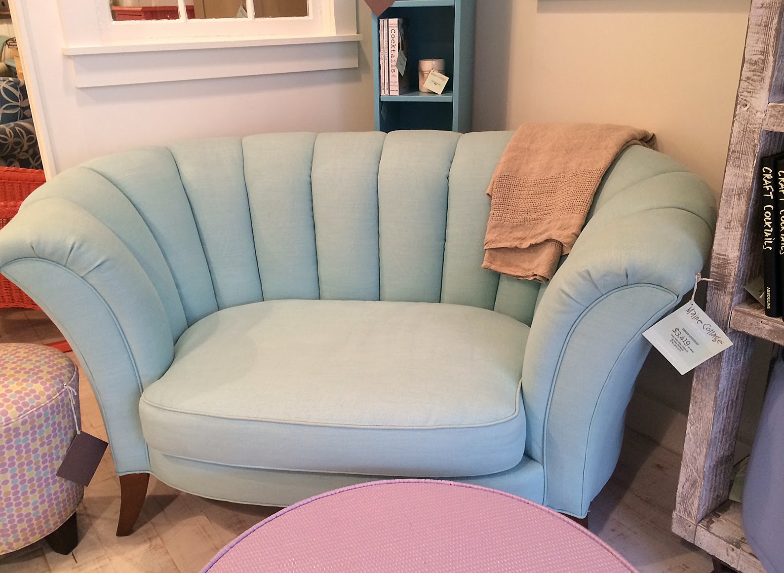
I don't know where I'd put a little loveseat like this but I'd sure put it somewhere because it is so comfy looking.

The Impatient Gardener -- Maine Cottage

If I had a summer cottage to decorate (and lots of money to do it) you can bet this nightstand would be in it. I just love that fish.


The Impatient Gardener -- Maine Cottage

Cottage-worthy bar cart.

The Impatient Gardener -- Maine Cottage


The Impatient Gardener -- Maine Cottage

They had these amazing cutting boards that are painted and I just fell in love with them. These two kind of look like lobster pot buoys. I can't think the paint would hold up to repeated washing very well, but I think these could be so cool hanging on the wall when not in use.

The Impatient Gardener -- Maine Cottage


They also had this shape with a leather strap on the top. I'd get one just to hang on the wall.


I loved the floors. 


These round cork boards and the oval coat racks with shiny hooks are so pretty and I took a picture because this is one of those things you could definitely do yourself for a fraction of the cost. I wish someone would start selling unpainting round frames though, because I like me some round frames.


The counter at the Color Bar was so intersting. It appeared to be concrete that an old sail had been embedded into and then painted. 

The Impatient Gardener -- Maine Cottage

 So what do you think? Is this kind of cottage charm up your alley or better used for a bit of DIY inspiration? Or maybe it's just not your cup of tea at all ....


Labels: , , ,