A prudent DIYer does some testing when they work with a new product before jumping right into the real deal. I bet that would be really boring to read about. So, as a favor to you, when I decided to use chalk paint to redo my kitchen chairs I jumped right in with both feet and in the process I learned a few things that a prudent DIYer might not have. Well, they would have, but they would have learned them on a scrap piece of wood and what fun would that be?
Have you heard about
chalk paint? It is all the rage in blogland. And I am nothing if not a sucker for the latest and greatest thing. But here's the interesting thing about chalk paint in the blogosphere: most of the people writing about chalk paint are getting it for free. I'm not suggesting that they are singing the praises of this stuff just because they got it free, but I know that the expectations for a product that you get free are a lot lower than one you pay $34 a quart for. Yes, you read that right: $34 a quart. It's crazy expensive (and I am used to buying pretty expensive paint). The good news is that you really don't use much.
I'd like to say that what really attracted me to chalk paint was the beautiful finish, which is sort of a low luster, and certainly that was part of it, but what really appealed to me was the fact that chalk paint is purported to be relatively prep free. It appealed to the lazy person in me. And the one who posted that long list of projects I want to get done inside a few weeks ago.
The white, highly distressed Windsor chairs in the kitchen came with the house along with a really cool round table with a built-in lazy Susan that had to go when we put in the banquette. I never cared much for the chairs and I've always found them to be rather bland.
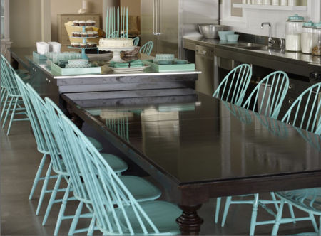
Then, on one of my late night/very early morning hours-long flips through Houzz (seriously I can stare at that app for hours on my iPad; it's not healthy) I found this picture and knew that I needed aqua kitchen chairs.
So here's another problem with chalk paint: there is a very limited color palette. But the good news is that you can extend the color range by mixing in one of the two white colors offered. Use Old White for a more antique look or Pure White for a more modern look. Or, if you're like me, just use both. OK, this all sounds well and good and even fun for crafty folk, but I'm no artist. One of my biggest frustrations is that I have a very hard time understanding color, no matter how much I want to. I can't tell you anything about undertones or hues or what colors go into any other color, so mixing colors willy nilly is a bit scary.
And for as much reading as I did about chalk paint, I never read the one main thing I found out about it: it dries a LOT darker. So that's how I ended up with bright baby blue chairs.
 |
| The chairs were highly distressed; a look I never really cared for. P.S. Someone please come clean our basement. |
 |
I had to do a small amount of repair to one of the chairs. Ever-so-innocent Hudson was an incredibly good puppy (as I recall 9 years later, and what dog isn't remembered as a great puppy when they are 9?) but his one transgression was a little recreational chewing on this chair. I just sanded it down with the Dremel and some rough sandpaper and then just gooped on some wood filler. I let that dry then sanded more. I wasn't really feeling patient enough to work hard at it so I was just aiming for it to look good from a distance. Since we keep only three chairs at the table and store the fourth in the basement for overflow seating, this one isn't even seen very much.
|
 |
The "repaired" cross base.
|
But let's back up a bit. Everything you read about chalk paint says you can paint right over any clean surface. Well, any clean wood surface. No need to sand or prime. So that's what I did. And that's what I'm going to recommend you DON'T do. Every time I knocked one of those chairs a little bit after I painted it, small bits of paint chipped off. I seriously doubt the finish is going to last too long, but maybe the wax will protect it (we're getting to that).
 |
| This picture doesn't show the difference very well, but my first try on the paint ended up really intense. Shown in all the Sunday morning messy-table glory. The box of sugar was not breakfast. |
Anyway, since I didn't like the color the chairs ended up, I mixed up more paint with equal parts Old White and Pure White and a little bit less of Provence. And they looked perfect. Until they dried. Again. Since the paint was now getting on them a little thick I had two options: sand them down and start over or try something else to lighten them up just a tad. And you know which one I chose.
First I tried to do a sort of whitewash over the top. Using just a tiny bit of the Old White, a drop or two of Provence and a lot of water, I "washed" the chairs, then wiped off the excess. That was OK, but the white was settling in the crevices a bit more than I would have liked. I wasn't really going for an antique finish ... just a sort of vintage, lived-in look, if that makes sense. And guess what, when they dried they were better but STILL too blue for my taste.
The preferred finish over chalk paint is soft wax and that's really what gives it that pretty luster. I had read that you can add paint to the wax to change the color of it, so I figured I had nothing to lose by adding some Old White to the wax. You need very little wax, so I just scooped out a small amount in a plastic dish and added a small amount of Old White paint to it and mixed it well.
I found the best way to apply it was with these small finish applicator disks I picked up Rockler woodworking when I was in the middle of the office countertop project. Rags always get so bunched up and hard to work with, but these little pads were perfect. I used one to apply the wax very thinly and really rub it in and one to follow up and buff with after it dried a little bit. In all, I did one coat of clear wax followed by two coats of the wax mixed with paint.
 |
| Finished chair after waxing. |
Thankfully, this worked. Well, I think it did. Maybe I was just forcing myself to imagine that it did because I was so sick of this project (another one-day project in my head that turned into a 10-day project). I think what really helped was buffing out the wax to get that slight sheen. The light reflects differently off them now than when it was just the paint, which is the most matte finish you can imagine.
So here's my personal low-down on chalk paint:
The good:
• Absolutely no fumes. It smells like nothing and that's a wonderful thing.
• Very easy cleanup. It was very easy to clean brushes, my hands, even clothing that had gotten a drop or two of paint on it.
• The finish. I really liked the luster that came with using the Annie Sloan Soft Wax. It definitely is suitable for a more vintage look but it wouldn't be appropriate for a sleek modern look.
The bad:
• Cost. This is pricey paint, but it really does last a very long time and I found it to be very helpful to add a bit of water to thin it out a little when painting. Because of that I think you can think of one quart as more like 1.5 or two quarts, so maybe the price isn't so bad after all.
• For more arty types, this might end up under the "Good" column, but the lack of color options wasn't good for me. Mixing colors isn't my thing and I found it to be much harder than I expected to get the color I really wanted
• It dries WAY darker than it looks. All paints tend to dry a bit darker, but nothing like chalk paint. This made it even harder for me to get the right color.
• Claims of not requiring any pre-painting prep are way overblown. I think you need to at least either sand or prime (maybe both, but probably not) in order to get a durable finish. Still, even if you only have to do one of those two things, you're still better off than with most paint.
One other thing to note that doesn't really fit in either column, but deserves a mention. There are visible brush strokes in the finish of this paint. I used the special
Annie Sloan paint brush, which I quite liked, especially for doing the spindles on the chair, so it can't be blamed on that. And in fact, a lot of the comments I saw on this paint were related to the brush strokes. I didn't mind them and some people say that's actually part of the charm of chalk paint. I think it I had sanded lightly I might have been able to make them less apparent or go away all together. But just be mindful of that when you commit to chalk paint.
 |
| Finished chairs at the table after waxing. That chair on the end never lays nicely at the table. Shall we see why? |
 |
| It seems that Rita doesn't think that chair needs to be there, so she just moves it out of her way. See the small vent behind her? Even though the air conditioning hasn't been on for a couple weeks, she lays there willing it to turn back on. |
 |
| Totally pathetic, but I do think aqua suits her. |
You may remember that in my
big project list I mentioned that if painting the chairs worked out, I might repaint the kitchen table using chalk paint. So will I? Well, the jury is out. I'm leaning towards no, mostly because I have a weird thing about matching whites and I highly doubt I'll be able to get the color white I want just by mixing Pure White and Old White. I am, however, totally sold on soft wax for finishing. It seems to be very durable, gives such a lovely sheen and doesn't yellow, which is my biggest beef with how the table turned out. So if I work up the energy to repaint the table, I'll probably do with something like Benjamin Moore's Aura or Advance and then do a waxed finish on it.