The Impatient Gardener

03 January 2013

A year in review

Before we jump headlong into 2013 (OK, probably too late for that), I thought we'd just take a look back at some what happened over the past year here on The Impatient Gardener.

January
We started off the year with one of my favorite posts (and one I'll have to do again) in which a group of great garden bloggers told me about their favorite perennials. I bought everything that was on this list that I didn't already have.

Toad lily foliage
Gorgeous foliage on toad lilies from Linda at Each Little World. Linda has taken a break from blogging but I really hope she comes back for an encore appearance come spring. 
February
In February I talked more about perennials (the gardening but bites hard in winter). I attended a seminar that Richard Hawke, plant evaluation manager for the Chicago Botanic Garden, spoke at in which he listed his picks for the best perennials (for the area). I added a few of these to my garden in 2012 as well.
Echinacea Milkshake
Plants Nouveau photo

March
In March, Mr. Much More Patient and I took our first non-work related getaway ever to Hawaii where it pretty much rained the entire time. Still, we had a good time (not as good as we would have had if the weather had been what it's supposed to be on Maui).

Hawaiian beach

April
April brought an early spring to Wisconsin so we took advantage of the weather  to clean out our pigsty of a garage. We installed a great organizational system  and we built some shelves out of scrap wood for my pots. I'm happy to report it's still pretty organized. It gives me such hope to know that it was nice enough out in April to take on that project so we only have to get through three or four more months of winter before the outdoor fun can begin.

Garden container storage

I also posted my first (and so far only) video blog in which I showed you how to tie a bowline and told you why all gardeners and anyone who owns a house or car should know this knot.

May
I got my garden gadget geekery on in May. I still love all of those products from that post, although one of the timers broke toward the end of the summer.

Easy to use water timer


June
June brought my favorite gardening task of the year: planting containers. I was really happy with how most of them turned out except for one of the matching planters from the deck. By the end of July one of them was very unhappy. I took solace in the fact that so many of you told me that's why you never plant matching containers. A good lesson, perhaps.

Mandevilla container


July
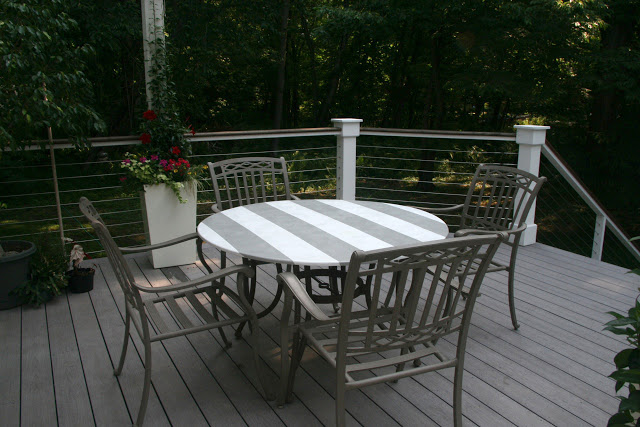
Taking a break from gardening, in July I created a very cool looking and ultimately very temporary tabletop. It looked great the time but even though I coated it in a lot of clear lacquer, it was pretty much done by the end of summer.

Striped tabletop

August
In August I showed you the funniest plant in my garden: The Family Jewels plant. By the end of the summer it was an aphid habitat but I thoroughly enjoyed it, if only for the humor factor, prior to that.

Family Jewels plant


I also spent a bit of time in England during the Olympics helping out Mr. Much More Patient at the sailing venue. Within 18 hours of getting there I was snapping an iPhone pic if my new BFF Kate. I can't wait for the baby shower invitation to come. Do you think she'll get a cake made out of diapers?

Kate checking out the Olympic sailing venue -- The Impatient Gardener


September
With summer coming to a close I started working on a few indoor projects, including painting the kitchen chairs a light turquoise. I used Annie Sloan's Chalk Paint for the first time and it took a little bit to get the hang of it.

Turquoise chairs with Newfoundland
You didn't think we'd get through a review of the year without a dog picture did you?


October
I got a lot done in October, including my one of my favorite DIY projects ever: recovering a pair of chairs. I'm hoping to take on my next reupholstery project in the next few months and I can't wait. I really found it to be fun.

How to reupholster a chair

November
During November I spent a little bit of time sharing my girl crush on Sarah Richardson, who is my absolute favorite television designer (and maybe interior designer of any kind, since the only interior designers I really know about are the ones on TV). The woman can do no wrong. Love her.
Sarah Richardson bathroom
HGTV Canada photo
December
And just last month, in between telling you about what a lame decorator I am, I shared some of the gifts I wrapped for family. I love wrapping and I really enjoyed doing some different things, even if I didn't win squat in the Paper Source wrapping contest.

Christmas wrapping


Labels: , , , ,

21 December 2012

My life in sofas

Sofas are sort of funny, aren't they? I mean, it's just a piece of furniture but they are a big deal. People agonize over sofa decisions, but rarely do they feel that same kind of angst when it comes to choosing a chair or side table.

I suppose that's because usually they are the most expensive piece of furniture in a room and no one likes to spend a lot of money on something they end up hating. Also, chairs and side tables come and go, but sofas tend to hang out for a long time.

It's interesting to look back at my life in sofas. I'm not counting the futon I had in college because futons should never, ever be considered furniture. They are actually torture devices. They are uncomfortable to sit on, hard to get up off of (even when you're young and in college), ridiculous to try to sleep on and impossible to move, given that they weigh a ton and constantly unfold. Plus, most futons are pretty gross, because let's be honest, you only really sleep on them when you are drunk.

So not counting the futon, I've had three sofas and the fourth recently arrived (I showed you a little sneak peek here).

traditional sofa leg (weathered maple finish) -- The Impatient Gardener


The first sofa came to me when I was in my second "grown-up" apartment. I was probably a year and a  half out of college (the futon apparently followed me to my first apartment because I don't recall a real sofa there) and had just moved from a small daily newspaper to medium-large daily owned by the same company in a different city. As a young reporter I was making essentially nothing so the priority was to pay the rent and the electric bill and have enough left over to buy gas to visit my then-boyfriend (now Mr. Much More Patient). My mom found me a FREE COUCH! When you're in that position, free is a lovely idea, but is it just me or is the idea of used upholstery from random people just a tad bit creepy? If you said no to that question let me throw this out there: What if that couch was free because the person who owned it was dead (and may or may not, for all you know, have actually died on the couch)?

But I was poor and free is free, even if it comes in a very low orange and blue plaid fabric-covered, as what came to be known as the "Dead Guy Couch" was. I covered in an navy blue sheet and then pretty much never sat on it.

I kept the Dead Guy Couch for the two years or so that I lived in that apartment (apartment No. 2 if you're only counting apartments after college or apartment No. 4 if you count the ones in college, which you probably shouldn't because I'm not sure they were actually habitable, particularly the one where I actually slept in a room out the back door of the house that had been a porch that someone stuck walls around and a wall-mounted propane heater to the wall). After that I moved, briefly, to New Zealand, so I had to purge or store a lot of stuff and as I recall, the Dead Guy Couch did not make the move to the storage unit.

When I came home from New Zealand (I can't tell you what kind of couch we had in our cute downtown Auckland apartment but I recall it being uncomfortable), the now-Mr. Much More Patient and I got a not-terrible apartment together and although between the two of us we had five toasters, we had no couch. And that's how we bought our first couch (this is a big moment in a relationship, let me tell you). And how did we buy that? One Saturday afternoon we went to a big-box furniture store, sat on three couches, said "Oooooh, look at the pretty red one," and bought it. It was rather hideous. The fabric was a cheap cotton that stretched like crazy so it always looked frumpy, the loose back pillows were remarkably uncomfortable, it quickly turned pink with the smallest amount of sun exposure and it was HUGE. The arms were easily 15 inches wide, no lie.

It's funny, the only photos I can find of that couch have the dogs on them, which seems strange because I thought we always had a "no dogs on the couch" rule. Apparently not. This is probably why it's so darn hard to keep Rita off the couch now (Hudson can't get up there anymore so I find this picture of him all curled up with his head on a pillow extra sweet).
Lounging on the ugly couch -- The Impatient Gardener

All cuddled up on the ugly couch -- The Impatient Gardener


When that sofa had all of the life sucked out of it, we got our first "good" couch. I spent a lot of time looking for it and even longer looking for the right fabric for on it. All in all, it was a success. I loved the lines of it and the fabric wore remarkably well, save for a few pulls in it. It faded a little bit, but not badly for a red couch in front of a window. Two things went wrong though: 1. The cat learned to love sitting on the bad cushions, which pretty much turned them to mush so only vigorous fluffing would make them stand up again, and 2. I think part of the frame might have broken. There seemed to be a bottomless pit in the hole where our butts most frequently were. And both of those problems probably could have been fixed but it turns out, I got sick of red. After almost 15 years of red, I just was done. And I was really sick of the French country-ish color scheme I had going on. I think it still looked good, I just got sick of it.

living room -- The Impatient Gardener

It was time for a big change.

And that's how I ended up with my first neutral-colored couch. I'd call it a light greige, but it's a tweed-type fabric with a small fleck of silvery blue in it (undiscernable from anything beyond microscope distance), chosen for its durability (I would have loved linen or velvet, but I was worried about how they would wear with what we put a sofa through). With its English arm and scalloped back, t's far more traditional that I was originally looking for, but I absolutely love it. It's very comfortable (I'm so happy to be finished with back pillows) but I do worry that the cushion configuration only allows you to flip them over rather than rotate all of them. I like to flip and move cushions a lot to keep from getting "butt marks" where you sit most often.

English arm sofa -- The Impatient gardener

English arm sofa -- tHe Impatient Gardener


A new rug should be on the way and I've started making some throw pillows to brighten it up. It was a big purchase, but I only had about two minutes of regret before I fell totally in love.

What's your history with couches? Do you change up the style and color or have you been lucky enough to find one you will always love and just reupholster it? I'm so hoping that's what this couch will be, but time will tell.

P.S. Don't worry, more Christmas stuff is coming to the blog. I've had this post sitting in the drafts folder for two weeks now so I thought it was time to share it. While a lot of blogs are powering down for the next several days, I'll be posting lots of Christmas stuff. I'm just late. Because I haven't done it yet. There, I said it. But it's coming ... honest!

Labels: , , ,

16 October 2012

Art at last!

We've been looking for a new sofa sort of off and on and a few months ago I walked into the place where we bought our last sofa and talked to the same designer who sold me the one we currently have. I told her exactly what I was looking for and she walked me around the showroom pointing out everything they had that might fit our needs.

The conversation went something like this:
Furniture girl: How about this one?
Me: Nope. Too tall.
FG: Oh, here's a nice one. What about this one?
Me: No, the arms are too skinny.
FG: OK, well, we have this one over here that might work.
Me: No, I don't care for that one either.
FG: This is why I love working with you. You know what  you want.

I'm not really sure she meant the first part of that last statement and but I know she had the second part backwards. I rarely know exactly what I want, but I do know what I DON'T want. I know the right "one," whether it be a sofa, art, lamp or even a husband, when I see it but I don't know exactly what I'm looking for until I lay eyes on it.

I also don't do placeholders. Early on in my decorating-my-own-place life I bought an awful Ikea chair that filled a space in a room just because it was cheap. I hated it. It was uncomfortable and kind of ugly and I think it scarred me for life. Since then I'd rather sit there with nothing or use something I already have that I don't like rather than buy something to fill in "until I find the right one."

And that's why the huge wall behind the banquette in the kitchen has been blank for three years. It drives me nuts and every time I show a picture of it I included a little asterisk about how I knew the wall looked stupid blank but I was waiting for the right piece of art to come along.

I can't tell you how much art I looked at, but none of it spoke to me. I thought about making my own driftwood sculpture or even painting my own canvas, but those certainly would have been disasters.

Since the kitchen is one of the most light-filled rooms in the house, I liked the idea of bringing the outside in with some kind of botanical, but I didn't want anything fussy or formal. And then I (well actually my friend and design sympathizer Roisin) found these vintage German schoolhouse charts at the Etsy store Bonnie and Bell.


Of course picky old me was not satisfied with the charts that were in the store. No, I needed something special (I told you, I know it when I see it). So I started working with Bonnie and Bell owner Linda to find just the right thing. I swear the woman is a saint. She poured through piles of vintage charts (she has all sorts of contacts in the European antiques world) until we found the oak one on the right. Then it was just a matter of finding the right partner for it. I really loved the colors in the Sundew, but then I did a little research on Sundew and found out it's a carnivorous plant and as weird as this may sound, I just wasn't comfortable with a carnivorous plant hanging over my table (visions of "Feed me, Seymour, danced in my head). The same went for some of the zoological charts Linda had. I absolutely love the chickens chart, but I have a hard time thinking about raw poultry while eating much less looking at chicken innards, as pretty as they may be.

Add caption


So I did a little research on these old charts and found one that I knew would work: horse chestnut. So Linda set out to find that chart for me and sure enough, in a couple weeks she located it for me!

I was so happy when I unrolled them. They are so lovely and wonderfully but gently worn. It's completely charming that they aren't totally perfect. One was printed in 1967 and the other in 1977 so they aren't THAT old, but just perfectly aged.

I once heard a designer say that every room can use a little black. Before I hung up the beautiful botanicals, the only black in the entire kitchen was the black cords on the pendants over the table. Originally I was worried that so much black on the wall might overwhelm the room or make it unbalanced, but I think it adds just the right statement to the room and actually makes those cords fit in more.

Check out what it looked like before.


And now after. Which do you prefer?


I'm so happy I waited to find the right thing for that wall. You know it's right when it just feels like home. And that corner just became my new favorite place in the house.

And one last look from a different angle (where you can see my homemade seed packet art works great with them.


There's great news to go along with this post. Bonnie and Bell's Linda (who apparently didn't tire of me even after I sent her on a wild goose chase) has agreed to work with me on a giveaway. Stay tuned for details!


Labels: , , , ,

16 January 2012

Kitchen dreaming

It's no secret that I love magazines. Nothing brightens a day more than coming home to a new issue in the mailbox. Interestingly enough, when it comes to shelter magazines, probably 90 percent of what I see in magazines is pretty/intriguing/fantastic/interesting but is not translatable to my life. What makes magazines great is that other 10 percent. The pictures and articles that illustrate what has been lurking in your head. The ones that say, "Look at me!"

The last two moments I had like that have come from Coastal Living magazine. The first was when I had just finished repainting the front door a darker blue and then saw a photo in Coastal Living and had to be talked off the ledge from repainting it immediately.

The second one happened this weekend when I saw pictures from a casual Key West home (you'd think that would be redundant, but it's unbelievable how many Key West homes featured in magazines end up feeling stuffy and overdone). The idea behind the house was "Modern vintage" which, the more I think about it, sort of sums up what I'm feeling my style has been lately. What grabbed me from the get-go was the kitchen.

IMG 0036

IMG 0037


Although sprucing up the working part of the kitchen isn't something we'll be doing immediately, it is part of the long-range plan. It won't be a total overhaul or anything, because most of what is there is just fine. But I'd consider refacing the cabinets (at the very least they need to be repainted) and replacing the counters. I know the cabinets will be white (I'm just a white cabinet kind of girl, I guess) but I've always envisioned a dark countertop. White on white kitchens are all the rage these days and I feel myself falling for the trend. What I like about this kitchen is how the cabinets are an off-white but the counters are true white. I think it's a really interesting look and not one I've seen before. It's all tied together with the great shell backsplash.

Up until now, I've envisioned some variation of a subway tile backsplash in our kitchen, but the mosaic in the Key West kitchen is interesting with just a touch of sparkle, but not too fancy. I'm a little bit obsessed with it.

Another trend this kitchen embraces is the whole open shelving concept. I have to admit, it's a super sharp look, but it's just not for me. First of all, it's one more area to "style" and this is something I struggle with. Also, half of our dishes are in the dishwasher most of time, so you either have a half-full shelf or you have to buy more dishes to fill it and then it's overstuffed when they are all clean. And lastly, all of the upper cabinets in my parents' kitchen are open and those dishes get dirty. About once a week my mom washes the top dish on every stack whether it's been used or not. For me, it's not practical. And while I can get behind a bit of form over function in a lot of spaces, for me, form has to follow function in the working part of a kitchen.

It's just a little something for me to obsess over during the depths of winter, before I allow myself to start dreaming in earnest about gardening.

P.S. I realize there's a great deal of irony in the fact that the images I posted are obviously screen shots from my iPad since I'm always extolling the virtues of real, printed magazines. In my defense, I'll just say that Coastal Living hasn't updated its website with the contents of the February issue yet and I couldn't wait to show you this kitchen so I had to view the magazine on my iPad (free for print subscribers) and screenshot the pages.

Labels: , ,

28 December 2011

2011 favorites

I've noticed that a lot of blogs are running posts featuring some of their most popular projects or posts from the past year and who am I to avoid hopping on a bandwagon?


So let's take a look at what you all were digging in 2011.


You really liked Looking back at the reno, a year later, and to be honest, I like it too. Even though it still wasn't that long ago, it's pretty amazing to see that our house went from this:

Oldhouseback


To this:

Newhouse1


This silly little lamp redo, in which I exercised my newfound love/respect for spray paint to save a pretty ugly lamp.

lamp1_031311.jpg

lamp4_031411.jpg


A bit of the house tour of the kitchen, which we really haven't done much work to, was also at the top of the list. And yeah, still no art over the banquette. I just don't do placeholders so I'm still waiting for the right thing to come along.

Kitchen2 101211


And from a room that hasn't been changed much (other than putting in that banquette, which I still think is one of the best changes we've made to the house) to a room that didn't exist a year and a half ago: the bathroom.

Reno3 101011


And I'm happy to note that I might prevent some of you from making some of the same plant mistakes I've made by telling you about some plants I'll (probably) never plant again including the dreaded artemesia 'Oriental Lime Light.'

Artemisia


I hope to bring you lots more interesting posts in 2012 and I so very much appreciate all of you who stop by daily, or just once, to check out the blog.

Labels: , , ,

03 November 2011

House tour: Guest bedroom and hallway

We're finally at the end of this rather prolonged house tour. `There are a couple rooms not worth sharing at this point, but maybe in the future if they get a little sprucing up I'll share them with you.
You've already seen the new bathroom, the kitchen, the living room and the master bedroom. Today we'll finish up the upstairs and show the hallway and the guest bedroom. Although the hallway got a bit smaller to allow for room for the bathroom on one end and the master bedroom closet on the other, it was important to us to preserve the character of it. We had several pieces of paneling custom made to match the existing panel so we could fill in the areas that were taller due to raising the roof.
It is open to the living room which helps the whole house feel bigger as well as allows the light streaming through all the new windows on the east wall of the bedrooms into the living room.
Here's what it looks like now (looking at the bathroom).
Hallway1

And here's what it looked like before:
Reno1 101011

And the new view of other end of the hallway:
Gallerywall
The gallery wall probably deserves a post of its own because in typical form, I made it far more complicated than necessary. But for now here is a close-up that shows some of the different blue colors I used to paint the frames.
Gallerywall2

From here we move into the guest bedroom, which is admittedly a bit sparse these days. I can't seem to get the furniture placement right in this room, so for now I've sort of plunk the bed under the windows. At a minimum, it needs a headboard (do I see a DIY project in my future?) and some art to cover the large expanses of gray walls, but it needs more than that too. But, I'll get there when I get there.
Guestbed

Many of the features are the same from the master bedroom. Same floors and plank wood ceiling. The nightstand and matching dresser (not shown) were custom made for my the girls' room in my grandparents' house. Four girls, two beds. It was a good thing they had cool furniture.
Anyway, onto the details. Let me know if I miss anything that you have questions about.
Paint
  • Trim, ceilings, staircase: Benjamin Moore Mascarpone
  • Hallway paneling: Benjamin Moore Gray Huskie (and yes, it is spelled like that, but if you try to buy it as Gray Husky, they won't find it)
  • Guest bedroom walls: Benjamin Moore Stonington Gray

Floors
  • Hallway: Original red oak floors (bleached)
  • Guest bedroom: Teragren bamboo Synergy Porfolio Brown Sugar

Bedding: Pottery Barn
  • Throw pillow: Target (but you knew that because everyone has that pillow, right?)

Lighting

Labels: , , ,

26 October 2011

House tour: Master bedroom

We'll finish up the rest of the house tour this week (it's a small house and I'm probably going to cheat and not show you the ugly rooms) now that I found the battery charger for the camera (whoops). So far we've toured the new upstairs bathroom, the kitchen and the living room.

Today we move up to the master bedroom, which is not the room that was the master bedroom when we bought the house. There is actually a room downstairs that was a bedroom when we bought the house and we preferred to have our bedroom upstairs so we took the south-facing bedroom.

As you can see, the before was, um, "modest." The ceiling was low in the middle of the room and really low on the east side. I actually took that side of the bed because Mr. Much More Patient couldn't get over there without hitting his head on the ceiling. There is no light fixture on the light because everyone would have hit their head on it. As it was the mister almost got banged in the head with a fan blade more than once.

Bedroom before

You'll also notice that the dreaded wall texture showed up in this room too. The only real tragedy of the upstairs renovation is that the bedroom floors couldn't be saved. They were original to the house and we were told they were "just Douglas fir" but when we had all the floors refinished shortly after we bought the house, we told them to just do their best with the bedroom floors and they ended up being absolutely gorgeous. I actually don't think our contractor really tried to save the floors and it still sort of bugs me, but what's done is done.

This is what it looked like after one day of demo. The old chimney (make of Cream City brick, which is a material unique to the Milwaukee/southeastern Wisconsin area) had been sandwiched in the walls and was removed brick by brick. We also found out that the closets in both bedrooms had been cedar lined but someone had drywalled in the cedar. Don't you wish you could ask previous homeowners what they were thinking sometimes?

Bedroom during


And here's how it looks today.

Bedroombig

Bed


By putting in a small (5x5-foot) walk-in closet at the end of what had been the hall, we got rid of the small closets between the two bedrooms and we put that extra floor space into the master, which added a couple of feet to the room. The entire east side of the room is now windows, which not only floods the room with light that spills into the living room downstairs, but also gives us a bit of a view of the lake beyond our neighbors' houses when the leaves are off the trees. I designed the built-ins and we had the same great craftsman who built the banquette in the kitchen make them. He and his teenage son spent an entire day installing them and then I finished them myself. They provide a huge amount of storage and hide a little television as well.

I'm still using the old headboard, which I don't think particularly works anymore but it's one of those things that was one of my first big "grown-up" purchases and it's tough to get rid of those. We have no art hanging in here yet, and I think I need a couple of mirrors to flank the bed. You'll notice that the nightstands don't match, which is a look I prefer although ours REALLY don't match. Still, I don't mind the look. I bet you can tell which side is mine and which is Mr. Much More Patient's.

The wood-plank ceilings are one of my favorite features in the room. What you can't see is that there's a bit of paint problem with them. The ceilings and the doors are the only things we paid a professional painter to do for us (upstairs) and I made sure that the knots in the wood were spot-primed with BIN shellac-based primer (a must for sealing knots). And I was told they were. Well guess what? Every knot had bled through and the ceiling looks like Swiss cheese now. I need to call the painter to see how we'll be dealing with this, but it's a drag. If you do this, make sure you spot-prime the knots!

Here's the info on the room:

  • Floors: Teragren Bambo Portfolio Brown Sugar (self-installed)
  • Paint: Walls: Benjamin Moore Revere Pewter, trim, ceiling and built-in: BM Mascarpone
  • Duvet cover: Rough Linen
  • Nightstands: Pottery Barn (white) and World Market (wood)
  • Lighting: Lamps Plus


Things left to do in this room:

  • Art! I must get something on these walls. It's driving me mad. I just need to find or create the right thing.
  • Mirrors. I think mirrors would be good behind the nightstands.
  • Banquette cushion (I borrowed pillows from the kitchen banquette for the photos). I have the fabric, I just need to get my mom to help me make it.

Labels: , , , ,

13 October 2011

House tour: The Kitchen

From a room that didn't even exist a year ago, our tour moves to the kitchen, which has had some modifications made over the years but is largely the same as it was when we bought the house.

Kitchen1 101211


Kitchen2 101211


The cabinets, countertops (laminate, but not bad looking, and very easy to keep clean) and window treatments haven't changed. We did replace the white vinyl kitchen floor with porcelain tile, bought new appliances, moved the laundry out of what should have been a pantry and made it back into a pantry (next to the dividing wall between the eating and cooking areas, shown just in the bottom left corner of the second photo). I also painted the walls and the paneled ceiling, which was sort of pickled pink.

The eating area has changed quite a bit. We took it from a round table that seated four people and stuck out into the walkway from the back door (the most frequently used entrance) to a banquette that can seat seven or more. We still badly need a piece of art on that wall, but I'm picky about art and haven't found the right thing for that spot.

Paint

  • Walls: Benjamin Moore Revere Pewter
  • Trim, ceilings, banquette, table: Benjamin Moore Mascarpone AF-20
  • Cabinets: Unknown color badly in need of painting, but it's close to Benjamin Moore White Dove

Sources

  • Banquette: Custom made (if you are local, contact me for information)
  • Banquette fabrics: www.fabric.com, www.joann.com
  • Entry rug: Dash & Albert indoor/outdoor (highly recommended, washes up bright white in the washer)
  • Table: Restoration Hardware Outlet
  • Chairs: Existing
  • Eating area lights: Velocity Art & Design
  • Butcher block light: Pottery Barn (several years ago, I don't know if they still carry it)
  • Sink light: Barn Light Electric


Here's a roundup of some of the projects we've done in the kitchen:

The future of the kitchen:

I'm not finished in here yet. At the very least the cabinets need a coat of paint, but I'm not satisfied to stop there. Once we've recovered a bit financially from the renovation, we'll do some sprucing up in here. What we do will be largely driven by budget, but ideally, I'd like to continue the cabinets all the way up to the ceiling by adding another row of cabinets on top of the existing cabinets sort of like this:

269138361 7CJ9opLo c

via Pinterest

There is nothing wrong with our cabinet boxes, so I'd keep those, but if the budget allowed, I'd have them refaced, skipping the arches that are seen on the top cabinets. I'd also like to turn some of the lower cabinets into drawers if possible. And then, of course, I'd like new counters, but every day I go back and forth on what those might look like. I'm pretty sure I'd pick a quartz though, as I'm thrilled with how our bathroom counter has performed and as beautiful as marble is, I'm not a person who would be satisfied with a counter that gets "a patina." And last but not least, I'd add in a backsplash, probably some variation on classic subway tile like this elongated tile:

151997884 UGdGsO4s cvia granitegurus.com

Labels: , , , ,

11 October 2011

House tour: The bathroom

I know I've show some (OK, a lot) of photos of the renovation here, but I thought I'd do a bit of a house tour now that I have some good photos of the rooms thanks to getting the photos from the article that was done on the house (a wide-angle lens is a beautiful thing).

And there is no better place to start than my favorite room that came out of the renovation: the upstairs bathroom. Since we were a one-bathroom household before this (and that bathroom leaves something to be desired in the space and decor department), it was a real treat to be able to make room for a second bathroom, and, as I've mentioned before, any splurging that happened in the renovation, happened in this room.

Here's what the space that became the bathroom (thanks to raising the roof and adding a small shed dormer) looked like before. Take special note of the absolute hideous wall texture. The peak of that mini dormer ceiling was 5 feet 3 inches.

Reno1 101011 copy

And here's what it looks like now.

Reno4 101011


Reno2 101011

Reno3 101011

Bathroom2 040311


Bathroom11 040311


Paint:


  • Walls: Benjamin Moore Gray Mist
  • Ceiling: Benjamin Moore Healing Aloe
  • Trim: Benjamin Moore Cloud White

Fixtures (All Kohler unless otherwise noted):

  • Sink: Archer undermount
  • Vanity faucet: Margaux
  • Shower valve trim: Purist
  • Showerhead: Flipside 02 (LOVE this thing!)
  • Toilet: Toto Carolina II
  • Towel warmer: Runtal Neptune

Other:

  • Countertops: Hanstone Ruscello Aspen
  • Vanity/cabinet: custom, made of beech veneer
  • Teak shower floor (removable) and teak niche shelf
  • Mirror: Pottery Barn Kensington pivot mirror
  • Bath fan/light: Panasonic Whisper
  • Vanity lights: Sonneman 1-Light pendant
  • Door: Salvaged from my grandmother's house

Sources


Let me know if I missed anything or you have any other questions.

Wide angle photos by Sam Arendt/Ozaukee Press


Labels: , , , ,