The Impatient Gardener

12 November 2015

DO GARDENS HAVE TO MATCH THE HOUSE?

I got my latest issue of Gardens Illustrated magazine the other day. I say "my" latest issue, because this British pub take a long time to get to a mailbox in the U.S. and I believe the next issue is already out in England. I put up with that because it's a fantastic magazine, one that has earned shelf space next to my collection of Fine Gardening magazines.

After giving it a once-over (that's how I read magazines: zip through them and then go back and actually read them), I read Frank Ronan's column. Unfortunately it was not on the website so I can't link to it, but it was all about disregarding the style of your house when designing a garden. The subhead was, "Planting your garden to conform to the period of your house is ridiculous, says Frank."

According to Ronan: "The house is a fixture, and I agree that if you extend the original architecture should be respected. But the garden around it is a fluid thing, which cannot stand still for a day, let alone the aeon that a solid house should last. To make the garden conform to the architecture is as ridiculous as dressing in the clothes of the period, and as pretentious."

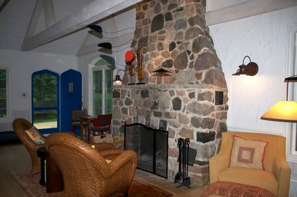
I'll be honest: I have always tied garden design to a house's architecture in some way. I have a hard time envisioning my house with anything other than a cottage-style garden. In no way can I imagine a walled English garden at my parents' mid-century modern house.

At the same time, I've long preached that you don't have to follow the rules in your garden. It's yours; do what you want. Maybe that means I fall somewhere in the middle on this. Still, it seems to me that some houses are MADE for a specific kind of garden.

Would this work outside any other style of house?

I tried very hard to find photos of gardens that don't match their houses but it was very difficult (note: This is different from gardens that have no style whatsoever; those don't count for the purposes of this discussion). Maybe this says more about Ronan's point; that it really doesn't matter.

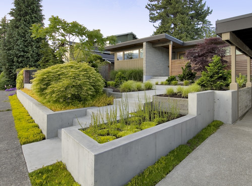
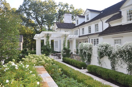
What kind of house would you expect to see attached to this garden?

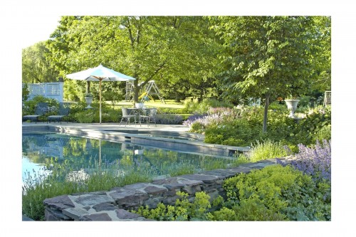
Did you think it would look like this?

This garden is interesting to me. It's certainly very symmetrical which lends itself to a formal style.

And yet when you see a broader view of the house, I think a more free-flowing style garden would be equally nice. Clearly this kind of thing is what the owners were after.

What do you think? Do gardens need to match the style of the house?


Labels: ,

28 December 2011

2011 favorites

I've noticed that a lot of blogs are running posts featuring some of their most popular projects or posts from the past year and who am I to avoid hopping on a bandwagon?


So let's take a look at what you all were digging in 2011.


You really liked Looking back at the reno, a year later, and to be honest, I like it too. Even though it still wasn't that long ago, it's pretty amazing to see that our house went from this:

Oldhouseback


To this:

Newhouse1


This silly little lamp redo, in which I exercised my newfound love/respect for spray paint to save a pretty ugly lamp.

lamp1_031311.jpg

lamp4_031411.jpg


A bit of the house tour of the kitchen, which we really haven't done much work to, was also at the top of the list. And yeah, still no art over the banquette. I just don't do placeholders so I'm still waiting for the right thing to come along.

Kitchen2 101211


And from a room that hasn't been changed much (other than putting in that banquette, which I still think is one of the best changes we've made to the house) to a room that didn't exist a year and a half ago: the bathroom.

Reno3 101011


And I'm happy to note that I might prevent some of you from making some of the same plant mistakes I've made by telling you about some plants I'll (probably) never plant again including the dreaded artemesia 'Oriental Lime Light.'

Artemisia


I hope to bring you lots more interesting posts in 2012 and I so very much appreciate all of you who stop by daily, or just once, to check out the blog.

Labels: , , ,

13 October 2011

House tour: The Kitchen

From a room that didn't even exist a year ago, our tour moves to the kitchen, which has had some modifications made over the years but is largely the same as it was when we bought the house.

Kitchen1 101211


Kitchen2 101211


The cabinets, countertops (laminate, but not bad looking, and very easy to keep clean) and window treatments haven't changed. We did replace the white vinyl kitchen floor with porcelain tile, bought new appliances, moved the laundry out of what should have been a pantry and made it back into a pantry (next to the dividing wall between the eating and cooking areas, shown just in the bottom left corner of the second photo). I also painted the walls and the paneled ceiling, which was sort of pickled pink.

The eating area has changed quite a bit. We took it from a round table that seated four people and stuck out into the walkway from the back door (the most frequently used entrance) to a banquette that can seat seven or more. We still badly need a piece of art on that wall, but I'm picky about art and haven't found the right thing for that spot.

Paint

  • Walls: Benjamin Moore Revere Pewter
  • Trim, ceilings, banquette, table: Benjamin Moore Mascarpone AF-20
  • Cabinets: Unknown color badly in need of painting, but it's close to Benjamin Moore White Dove

Sources

  • Banquette: Custom made (if you are local, contact me for information)
  • Banquette fabrics: www.fabric.com, www.joann.com
  • Entry rug: Dash & Albert indoor/outdoor (highly recommended, washes up bright white in the washer)
  • Table: Restoration Hardware Outlet
  • Chairs: Existing
  • Eating area lights: Velocity Art & Design
  • Butcher block light: Pottery Barn (several years ago, I don't know if they still carry it)
  • Sink light: Barn Light Electric


Here's a roundup of some of the projects we've done in the kitchen:

The future of the kitchen:

I'm not finished in here yet. At the very least the cabinets need a coat of paint, but I'm not satisfied to stop there. Once we've recovered a bit financially from the renovation, we'll do some sprucing up in here. What we do will be largely driven by budget, but ideally, I'd like to continue the cabinets all the way up to the ceiling by adding another row of cabinets on top of the existing cabinets sort of like this:

269138361 7CJ9opLo c

via Pinterest

There is nothing wrong with our cabinet boxes, so I'd keep those, but if the budget allowed, I'd have them refaced, skipping the arches that are seen on the top cabinets. I'd also like to turn some of the lower cabinets into drawers if possible. And then, of course, I'd like new counters, but every day I go back and forth on what those might look like. I'm pretty sure I'd pick a quartz though, as I'm thrilled with how our bathroom counter has performed and as beautiful as marble is, I'm not a person who would be satisfied with a counter that gets "a patina." And last but not least, I'd add in a backsplash, probably some variation on classic subway tile like this elongated tile:

151997884 UGdGsO4s cvia granitegurus.com

Labels: , , , ,

11 October 2011

House tour: The bathroom

I know I've show some (OK, a lot) of photos of the renovation here, but I thought I'd do a bit of a house tour now that I have some good photos of the rooms thanks to getting the photos from the article that was done on the house (a wide-angle lens is a beautiful thing).

And there is no better place to start than my favorite room that came out of the renovation: the upstairs bathroom. Since we were a one-bathroom household before this (and that bathroom leaves something to be desired in the space and decor department), it was a real treat to be able to make room for a second bathroom, and, as I've mentioned before, any splurging that happened in the renovation, happened in this room.

Here's what the space that became the bathroom (thanks to raising the roof and adding a small shed dormer) looked like before. Take special note of the absolute hideous wall texture. The peak of that mini dormer ceiling was 5 feet 3 inches.

Reno1 101011 copy

And here's what it looks like now.

Reno4 101011


Reno2 101011

Reno3 101011

Bathroom2 040311


Bathroom11 040311


Paint:


  • Walls: Benjamin Moore Gray Mist
  • Ceiling: Benjamin Moore Healing Aloe
  • Trim: Benjamin Moore Cloud White

Fixtures (All Kohler unless otherwise noted):

  • Sink: Archer undermount
  • Vanity faucet: Margaux
  • Shower valve trim: Purist
  • Showerhead: Flipside 02 (LOVE this thing!)
  • Toilet: Toto Carolina II
  • Towel warmer: Runtal Neptune

Other:

  • Countertops: Hanstone Ruscello Aspen
  • Vanity/cabinet: custom, made of beech veneer
  • Teak shower floor (removable) and teak niche shelf
  • Mirror: Pottery Barn Kensington pivot mirror
  • Bath fan/light: Panasonic Whisper
  • Vanity lights: Sonneman 1-Light pendant
  • Door: Salvaged from my grandmother's house

Sources


Let me know if I missed anything or you have any other questions.

Wide angle photos by Sam Arendt/Ozaukee Press


Labels: , , , ,

15 June 2011

We interrupt your gardening to give you a reason to drool


Erin over at House of Turquoise is doing a house tour of maybe the most amazing "real" house I've ever seen. You'll never believe that this is in Utah! I love damn near everything about this house, so the point where I'm seriously considering repainting the famous blue front door the same color as the one on this house: Ben Moore's Wythe Blue.

Anyway, if you haven't already seen this house, go take the tour and follow the links at the bottom to see the rest of it.

Click here for the dream tour: House of Turquoise: Day One: Dream Home Tour

Labels: ,

14 March 2011

A sunny before and after (+ a sneak peak)

How about a little before and after to start the week?


I bought this lamp at Target about five years ago or so and honestly, I don't know what I was thinking with that shade. It sat in the guest room which really always was a decorating disaster. I think I was trying to go too many directions in the old room. So this time around, I wanted to keep it simple enough that even I couldn't screw it up: yellow, gray, white, black.

So I bought a new lampshade, because I really detested the shape of the old one. It was, I think, $9 at Target. I'm very into these great geometric patterns these days, such as the great Imperial Trellis and my current favorite China Seas Aga from Quadrille. Have you priced those fabrics? Let's just say that I don't have any shoes that cost more than a yard of it. I looked for a less expensive option with a similar feel but had no luck. If I had found something I would have just wrapped the lamp shade in it, trimmed it out with more ribbon and been done with it.

But that was not to be. So I made my own pattern with painter's tape and some spray paint. I couldn't find tape that was skinny enough so I bought the one-inch Frog Tape and sliced it lengthwise into three pieces. The I measured out every three inches on the top and bottom of the lamp shade, and made a criss-cross pattern. It wasn't perfect because the bottom of the shade is 2 inches bigger than the top, but it was close enough. Then I went back and cut out some of the sections.

This is what it looked like when the taping was finished. I also taped a piece of waxed paper over the top to keep spray paint from coating the inside of the shade.


Then I just took some "Pewter gray" spray paint and did two light coats. In the meantime, I spray primed (I like the Zynsser BIN primer) and spray the lamp a bright yellow.

And here's what it looked like with it was finished.


And here's a few sneak peeks of it in the new guest room. Obviously this room has a way to go. The bed needs a headboard. A rug would be good I think. And there is a giant wall crying out for some art. Plus, I'm not sure the furniture layout is right. Still, you get the idea.

Photobucket


Photobucket


And what do you think about that light on the ceiling fan? I mentioned it before (here) and as I suggested then, opinions on it appear to break down entirely on gender lines: men hate it, women love it.


Labels: , , , ,

23 February 2011

Maximizing storage

Anyone who lives in a small space knows that you have to find storage space anywhere you can. Even people who live in large homes tend to need more storage than they have. But that's the thing about storage: stuff tends to just fill the storage void. How many of you know someone with an empty drawer in their house? I'm not sure I've ever heard of such a thing.

Anyway, prior to the renovation, we were seriously lacking in bedroom storage space. We had one small reach-in closet that only accommodated my clothes. Mr. Much More Patient's stuff was relegated to the guest room closet. And while that's not that big of a deal (he didn't seem to mind), it would be nice for a guest to actually have a place to hang their own clothes and should that room ever be used on a more permanent basis, he'd certainly have to get his stuff out of there.

We also had a dresser/armoire type thing in the bedroom. I bought it at a big-box store as an assemble-yourself unfinished furniture piece. Thinking back, that may have been my first DIY project. I have to laugh now because I saw a segment on Martha Stewart's show about how to paint furniture and I did it exactly as she did. I mean, I even used the same colors because I wasn't sure it would "work" if I didn't.

Photobucket
This photo was taken the day the renovation started. The blue dresser/armoire thing on the front patio was my Martha Stewart-inspired DIY project. I hated that thing. It, the gross chair and whatever else was sitting on the patio was headed for the dump.


When I put the thing together I didn't even realize that drawers should be square. So they never stayed in the glides right and constantly fell out. I couldn't wait to get rid of that thing even though several people were horrified that I threw it out (I couldn't donate that piece of junk to someone else to lose their mind over).

Dressers, however, are expensive. I actually picked up a nice one at Goodwill that is almost identical to one John and Sherry from Young House Love bought. That's still sitting in the garage though. Instead, we had the awesome craftsman who build our banquette for us, build the world's biggest built-ins for our bedroom. Because there is a sort of recess in the wall created by the angled roof for the shed dormer, it really does feel built-in, rather than like a massive piece of furniture jutting out into the room. Since it also incorporates a small window seat, we can get by very nicely with just a bed and two nightstands as free-standing furniture in the room. More furniture would fit in the room, but I'm really enjoying the open space after living for so long in an itty-bitty room.

Photobucket
OK, so I know you're thinking that the window seat looks really shrimpy, but I plan to put a four-inch cushion on it like we did in the kitchen because it's super comfy.

Photobucket
Mr. Much More Patient was worried about creating a "tunnel" around the window, so we opted for open shelves on either side of the window. A small television fits in the lower set of doors, and bookcase-type storage is on top. It's pretty tall and won't be very easily accessible, but we felt like we needed something to bridge the units on either side of the window. What do you think?

Photobucket
It blows my mind that we went from a crappy dresser with drawers that didn't close to NINE amazingly huge drawers on full-extension glides. I can't even imagine the joy of a world where you can actually see what's in the back of the drawers. Oh and they are automatically closing hinges. BOOM! (Or actually not boom because that's what the slow close is all about.)

We also were able to squeeze in a mall walk-in closet. If you live in an older home or a small home or especially an older small home you know that a walk-in closet is the holy grail of storage. Ours is far from palatial at roughly 6 feet by 5 feet, but it'll do the trick. But I'm a big one for maximizing storage and the worst atrocity that can be done to any closet is to stick up one high shelf and one rod. That sort of configuration wastes so much space. Most clothes that we hang in our closets are short, either shirts, skirts, jackets or pants folded over a hanger.

Photobucket
Do you know how hard it is to take a picture of a tiny closet without a wide-angle lens? Yeah, it's pretty much impossible, but this is as you look into the closet. The wall angles pretty steeply toward you here, so there are two shelves and then two pull-out shoe holders underneath.


I also detest a lot of closet organizing systems. Those white metal shelves with the big brackets holding them up are pretty unsturdy, but my biggest beef with them is that it breaks up the hanging part into little chunks so you can't slide clothing back and forth. And some of the particle-board systems you can find at the big box stores look so cheap and the shelves start to sag after awhile.

To maximize space in our old reach-in closet I bought an Elfa system from The Container Store. I used their design help which was nice since I'd never actually seen the system in person (a friend had recommended it) and didn't really know how it worked. That system at least doubled my storage space. So I knew I'd go with the same thing in our new walk-in.

Photobucket
This is one side of the closet. There is hanging space for long items (like dresses), a couple of shelves, and then a short hanging bar with a shelf above it.

Photobucket
We didn't NEED this, but I really, really wanted it. It's a gliding tie and belt hanger. Love it. You can also see in this photo how I customized the fascia. Normally it only fits between the shelf brackets, but I used a coping saw to cut out an area for the bracket and then just attached it as directed.

Photobucket
OK, I'm not sure it's the most practical shoe storage method, but damn it's cool.

Of course savvy shoppers should know that The Container Store runs a 30% off Elfa sale every year from the beginning of January to the middle of February, so hold off until then because it can get pricey quickly. The thing I like about the system is that the only thing you mount to the wall is the top bar. Everything else hangs from that.

I'm not going to get into a big commercial on Elfa because, well, they aren't paying me to or giving me free closet samples, but I really do like this product. I designed the closet myself this time because I had a much better understanding of the product. I also installed it myself, probably in about five hours or so (not in one sitting). This time I went for the 16-inch deep shelves, more for the accessory possibilities than the actual storage opportunities. And I did by a few things that maybe weren't entirely necessary, like the wood fascia (which I had to customize for my closet because they only work with certain length shelves), the tie and belt pull-out and the pull-out shoe racks.

I know you're all looking at that shoe storage area and think I'm nuts but for some reason I never got that whole female shoe gene. I have probably six pairs of shoes and usually wear only two of them. So I don't need a lot of storage space for them.

Anyway, putting this whole thing together was my first step toward living in a much more organized fashion. And with all the storage space we now have in our new master bedroom, not only will we both be able to keep our clothes in the same room, if we do run out of space it truly means it's time to clean out the closet because there's no way we should have more than we can hold in this space.

Labels: ,

21 February 2011

It gets worse before it gets better

Like a lot of projects, painting the stairs is one of those that has gotten a lot worse before it can get better.

Let these pictures serve as a lesson. Any time you feel like skipping some prep steps in a painting project remember this:

Photobucket
Not exactly inviting you upstairs are they?


At some point in our house's history some previous owner decided they couldn't stand the dark finishes everywhere so they whipped out their paint brush and painted everything they could. For that, I thank them, because I'm not sure I could have seen the charm of the house if it weren't for that. Still, I'd like to find them and hunt them down and force them to come undo all their damage. Apparently they were so eager to paint that they skipped the whole sanding and priming process and just stuck paint over stain and polyurethane. And that was the last thing that stuck, because the paint certainly didn't.

The knots in the wood on the risers bled through the paint and looked nasty. If you kicked the riser on the way up the stairs (not an uncommon occurrence), paint would fall off. I made it worse by not checking what kind of paint was used on them and putting water-based paint over the oil paint right after we bought the house. So I decided if I was going to paint these stairs (which they badly needed after the trashing they took during the renovation), I was going to do it right.

And that meant removing all the loose paint--most of it -- and sanding them thoroughly. So that's what I've been doing for awhile now.

Photobucket
The little paint flecks are from the paint scraper, but when I went in there with joint compound knife I was able to scrape sheets of paint off in some places. Let this be a lesson, kids: sand and prime before you paint!


After sanding, I spot primed the knots with Zynsser BIN shellac primer and I'll prime them all with Benjamin Moore's Fresh Start primer. This might go down as one of the most tedious projects I've done on the house, but I am looking forward to a beautifully painted staircase.

Labels: ,

16 December 2010

Construction Update No. 11: Down to the finishing touches

I'm happy to say that we are actually to the point in this renovation where I don't want to share too much in terms of updates, lest I ruin the big reveal. That, folks, is a good thing.

There's actually a chance we could be done (OK, probably not with all the painting, but maybe) by Christmas New Year's. I hesitate to even SAY it because it seems too good to be true. In fact it probably is. I probably just jinxed it.

But I thought I should catch you up on what's been happening.

The 2x4s that held up the little gable over the front door have been removed and the brackets were installed. I'm very happy with how they turned out. We designed them and the GC had them built for us. The siding around them has since been replaced and the siding on the front of the gable is also finished. We've not stained the beadboard ceiling in it yet, because it's just too cold for staining. We are actually thinking about going with a mid-to-dark stain vs. a solid white stain. What do you think? I'm thrilled with the new light there too, which was a pretty economical find.

Photobucket


The decking, stairs and posts are all finished. Right now I think the posts look sort of ridiculous, but I'm hoping once we get the top rail on they will look better. We'll be doing cable railings as well, but Mr. Much More Patient and I are doing those ourselves (we've had all the parts and pieces and two huge rolls of stainless steel cable sitting in our garage for about four months now), that may have to wait until spring to be finished.

Photobucket
Hudson surveys the scene from the deck. The stairs he's looking at go into the yard but he doesn't like those. We had the stairs that go to the patio purposely made with a short rise to make it easier for our aging four-leggeds.

Speaking of the top handrail, this is a good remodeling lesson. We really fell in love with the idea of a dark hardwood top rail similar to what you might find on ship. Unfortunately those suckers are expensive. The one we liked the most (ipe) was $10.50 a linear foot. Another one (garapa), which wasn't the right color but we figured we could stain it, was $7.50 a foot. Another option (cumaru) was $5.50 a foot, but only came in a 4-inch wide version and we really wanted something beefier. Then our GC was at a local lumber store and he came across some handrail parts in a remnant bin. Turns out they were leftover from a large project and they had many more. Because we only need relatively short sections (the railing will go between each post, which is a design I'm sort of regretting, but it is what it is and hopefully it will look great), he was able to cobble together enough to do our smallish deck, for just $3.70 a foot. Score!

Photobucket
The stairs into the yard ended up much longer than any of us expected, but once we graded the yard, things changed a little. The skirting for the bottom will be cedar lattice (square, not diagonal) that we're staining gray.

Perhaps the most exciting progress to report is in the new bathroom. The tiling is almost complete (there's some that can't be finished until the vanity counter is installed). Don't pay attention to the paint colors in these pictures, because it's all been changed ... AGAIN!

Since these photos were taken the toilet and shower fixtures have been installed. Tomorrow the vanity and linen unit go in and as soon as that's in we can finish up all the light fixtures (I really hope I measured where to put the pendants over the vanity correctly because there are some big holes in our ceiling), mount the mirror and work on getting the towel warmer up (I have a feeling that's a complicated project). The glass for the shower has been measured and it MAY show up between Christmas and New Year's but I'm not betting on it. And the vanity countertop seems to be but a distant hope at this point.

Photobucket
The finishing touches for the shower will be a teak dividing shelf in the niche, a teak floor grate and a frameless glass enclosure.

Photobucket
The wall color has changed since this photo (the BM Healing Aloe was way too light, but I ended up using it on the ceiling) and the toilet has been added in the corner.

We are clear to move back into the bedroom as soon as I finish touching up the paint and can eat enough Wheaties to get the mattress back up there, so we're definitely down to the finishing touches at this point.

Want to see where we've come from? Here are all the old house renovation updates:

Construction Update 1
Construction Update 2
Construction Update 3
Construction Update 4
Construction Update 5
Construction Update 6

Construction Update 7
Construction Update 7.5
Construction Update 8
Construction Update 9 
Construction Update 10

Labels: ,

26 October 2010

Construction Update 8: Shades of gray

I've (and I say I've because I get no help whatsoever from Mr. Much-More-Patient on these matters) chosen almost all the paint colors for the remodeled areas of the house and even though I wasn't conscious of it at the time, it appears I'm really into gray at the moment.

Let's start with the most important choices: The living room ceiling and walls. Because our living room ceiling is crazy tall, painting it will never be a DIY project. And because I'm paying someone to do it, I want to make sure I like it the first time. There's no way to guarantee that, of course, but I'm going with what I know on this one.

Photobucket
The living room was white white ... in fact there was no paint on the walls. Just drywall compound.

The old walls were the horrible swoopy plaster stuff, that was white. In fact it was so white because it had no paint on it. So take a bucket of drywall compound, smear it on your wall and let it dry. That was the color of the walls. I didn't want white white, but I definitely wanted something that I knew I wouldn't tire of. (By the way, all the color samples here look really strange and don't even look all that close to the actual color to me, but just go with it!)

Photobucket
Mascarpone


So the walls and ceiling in the living room will all be Benjamin Moore (all colors are BM, even if they won't necessarily be painted using BM paint) Mascarpone (AF-20). You may remember this color from my totally boring and seemingly neverending search for the perfect white. This the color that all the trim in the house (except for the bathrooms) will eventually be (when I get to it). It's a nice warm off-white that I don't find too creamy or too yellow. I was unsure about the trim and the walls being the same color but then I looked around the Internet a little and it seems that's quite the trend these days. That's not why I'm doing it, but hey, I'll go with it.

Photobucket
This really bizarre picture of the mobile that came with the house—we liked it so we just left it right where it was—shows the one wall in the living room that is fully paneled. The gray we're going with will be a little darker and a little warmer than what's there. Also, that horrible swoopy plaster stuff on the walls is gone! Oh happy day!
gray huskie
Gray Huskie


One full wall in the living room as well as the wainscotting on the other walls is random width paneling. This had been painted a light gray color that sometimes looked white in low-light situations. It didn't look quite right with the Mascarpone, so I'm taking it a few shades darker and a little warmer with Gray Husky (or Huskie, depending on which fan deck you're looking at). This paneling is also on the walls in the upstairs hallway that is open to the living room and up the staircase. I was (and am) worried it may be too dark, but I wanted enough contrast to notice it and that will certainly happen with Gray Husky. Incidentally, I've been toying with the idea of refinishing the beams, but it's not something I ever even considered until a week ago or so. I figured it would be safer to live with it for awhile before deciding if they should be refinished. Part of me wants to wait because I don't know whether to go with a weathered cedar look or just white. So, if anything, that's a project for the future.

One other thing about the colors for the living room: I have completely tired of the sort of modern French country colors that are currently in the room. I yearn for a crisp navy, tan and off white palette in the worst possible way. Because of this renovation, however, that's not in the cards at the moment (although it wouldn't be horribly expensive, but it would require a new couch and two new rugs. I'd recover the chair and ottoman and the coverings on the other other chairs in the room would be DIY projects. Anyway, I chose the colors for the living room with this in mind so that down the road, when we can change things around, we'll be able to without having to paint yet again.


Photobucket
Revere Pewter in the kitchen.


revere pewter
Revere Pewter


In our bedroom I'm going to go with Revere Pewter. This is the same color I used in the kitchen and I really love it. It changes throughout the day from gray to beige but it always feels warm and like a good neutral vs. a lazy neutral (that is, one of those "safe" colors).

Both bedrooms will have wood plank (all the contractors call is car siding, which is a term I've never heard before) ceilings painted Mascarpone.


Photobucket
Stonington Gray


The other bedroom, which is going to be yellow, black, gray and white, is going to have its walls painted Stonington Gray.


Pale smoke
Pale Smoke

quiet moemtns
Quiet Moments


The bathroom paint color is still up in the air but I'm looking for a grayed blue or green. I want a color that looks gray when you look at it by itself but skews blue when looked at with the Caribbean blue accent tile that will in there. I'll be doing tile halfway up the walls so this is only for the top of the walls and the ceiling, which I think I'm going to paint in a 50% dilution of the wall color.

As you can see, it's all a little gray, but I think there's enough variation that it will still be interesting. And, as I always remind myself, other than the living room ceiling, it can all be repainted when I leave my "gray" phase.

In case you want to check out the previous construction updates here they are:


Construction Update 1
Construction Update 2
Construction Update 3
Construction Update 4
Construction Update 5
Construction Update 6

Construction Update 7
Construction Update 7.5

Labels: ,